Stamp Stories: Turning Vintage Postage into a Striking Gallery Wall
Today we explore upcycling vintage postage into gallery-wall art, transforming tiny messages from distant years into bold, sustainable design. We will pair conservation-minded techniques with imaginative layouts, honor history without museum stiffness, and create a living conversation piece. Bring your shoebox finds, thrifted frames, and curiosity. Share your progress, ask questions, and swap sources with fellow readers as we celebrate color, paper, glue, and the quiet thrill of discovering time folded beneath a canceled mark.
Sourcing with Soul: Finding Authentic Vintage Stamps
A meaningful collection begins long before the wall. Hunt in flea markets, estate sales, dusty albums, and kind philatelists’ grab bags, focusing on stamps with character, legible postmarks, and stories. Balance scarcity with charm, choosing pieces that feel lived-in rather than pristine trophies. Learn gentle handling from the start, so your discoveries survive framing. Approach every purchase with patience, a modest budget, and a willingness to pass on anything that feels ethically murky or disconnected from the narrative you hope to show visitors.

Where to Hunt Without Overspending
Stretch your budget by exploring mixed lots, damaged-but-beautiful duplicates, and envelopes with complete postmarks that dealers often overlook. Local auctions, community swaps, and online classifieds can be goldmines when you buy bundles instead of individual rarities. Ask sellers for provenance when possible, not for value, but for context that enriches your wall. Invite readers in the comments to share trusted shops and fair-dealing vendors, building a communal map that helps everyone discover overlooked corners where affordable history quietly waits.
Authenticity Checks and Gentle Handling
Examine paper texture, printing methods, and gum remnants to distinguish genuine vintage pieces from modern replicas. Use soft-tipped tweezers and archival sleeves immediately, avoiding fingerprints and oils. Look for honest wear: creases, toning, and neatly torn edges can add personality when stabilized correctly. If something feels off, leave it. Better to miss a deal than to frame a questionable piece. Share your inspection routine in the discussion, and consider posting macro photos so others can help confirm details without risk.
Composing the Wall: From Tiny Prints to Big Presence
Choosing a Visual Storyline
A compelling arrangement reveals a journey. You might connect stamps by continent, monumental years, or design styles like engraving and lithography. Arrange left-to-right timelines or spiral clusters that pull viewers closer. Create breathing space between intense colors to prevent visual fatigue. Think of the wall as a conversation where each stamp answers another across the room. Encourage readers to vote on alternative sketches you post, and try multiple mockups, saving iterations to learn why some arrangements sing and others fall flat.
Color Harmonies and Confident Contrast
Vintage stamps come alive through carefully managed palettes. Group analogous hues for calm and continuity, then punctuate with complementary jolts for drama. Allow patina and aged paper to function as a unifying neutral. Mat boards can echo colors softly without competing. If a hue dominates, distribute it in different frames to balance the composition. Ask readers whether your reds read warm or heavy under your lighting, and invite them to recommend gentle filters or paint swatches that elevate the surrounding wall color.
Layouts: Grid, Salon, Ribbon, and Modular Variations
A crisp grid communicates order, perfect for graphic engravings and uniform cancellations. A salon-style cluster feels conversational and nostalgic, suited to eclectic shapes and envelopes. Ribbon arrangements snake across the wall, guiding the viewer’s eye like a route on a map. Modular sets can move seasonally, allowing playful refreshes. Trial layouts on kraft paper taped to the wall, penciling frame outlines before hanging. Share your mockup photos and measurements for feedback, and download community templates contributed by readers for foolproof spacing.
Preservation-Focused Framing that Looks Expensive
Protecting fragile paper while achieving a refined finish is absolutely possible on a modest budget. Use acid-free mats, buffered backings, and UV glazing to reduce fading. Choose reversible, conservation-safe mounting methods that never trap or stain. Secondhand frames can be rejuvenated with careful sanding and museum-tone paints. Practice patience: even a small collection deserves materials that will endure. Ask questions in the comments about sourcing archival supplies, and consider pooling orders with readers to lower costs while keeping quality uncompromised.

Inventive Mounting and Mixed-Media Ideas
Beyond straight matting, explore dimensional methods that honor fragility while adding drama. Float several stamps on linen-wrapped boards, or pair them with faded envelopes and wax seals in shadowboxes. Integrate thread, map fragments, and canceled date circles to underscore journeys without overshadowing originals. Consider removable micro-sleeves behind mats to avoid adhesives entirely. Encourage readers to trade process videos and step-by-step photos, building an evolving library of techniques that keep experimentation safe, reversible, and deeply respectful of the intimate scale of postal artifacts.
Storytelling that Connects People to the Wall
Great walls speak. Pair each frame with a sentence or two that captures where, when, and why a piece resonates. Use small labels, back-of-frame notes, or a discreet booklet on a nearby shelf. Consider a map with pins showing origins, letting visitors trace routes across oceans and decades. Invite family and friends to contribute memories, building a communal archive. Ask readers to comment with their own stamp stories, and compile the best submissions into a future feature that travels beyond your living room.

Install, Light, and Live with It

Planning and Hanging Without Regrets
Trace frame outlines on kraft paper, tape them to the wall, and live with the draft for a few days. Adjust spacing until the walk-by experience feels effortless. Use wall anchors appropriate to your surface, and hang with D-rings rather than sawtooth hooks for stability. Photograph measurements for insurance and memory. Invite reader critiques before drilling, and share your final layout so others can learn from your tweaks. Thoughtful preparation makes the last hammer tap feel calm, confident, and gratifying.

Light that Protects and Flatters
Balance color accuracy and preservation by choosing high-CRI lamps, warm temperature, and controlled brightness. Avoid direct sun; even brief daily blasts add up. Position fixtures to graze texture while minimizing reflections on glazing. Test angles at night and day, photographing hotspots. Consider dimmers for mood and safety. Encourage readers to report which bulbs shifted paper tones or tamed glare, building a collective reference. The right light transforms postage from small curiosities into luminous anchors that reward unhurried, thoughtful looking.
Care, Rotation, and Seasonal Refreshes
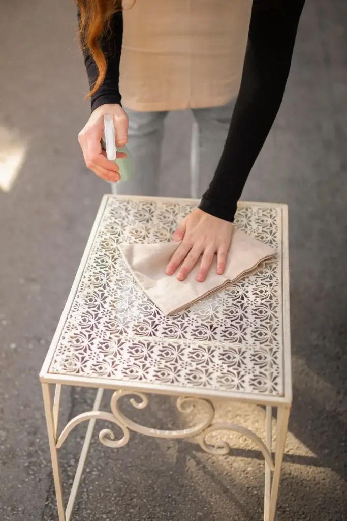
Dust frames with a dry microfiber cloth, never spraying cleaners near glazing. Check hinges annually and watch for warping or humidity creep. Rotate the most delicate pieces into storage sleeves, replacing them with cousins from your collection to keep the wall alive. Celebrate refresh days with photos and notes, inviting readers to vote on swaps and share their own rotations. This cadence protects paper, renews delight, and ensures your gallery remains a living archive rather than a static display slowly fading into silence.